
Anyone with me that cover design has gotten way, way better in the last ten years? Maybe it’s a controversial opinion, but I’m pretty sure that the books of yesteryear never looked so pretty. Walk into a library or a bookstore and it’s like being in a candy shop, every book on the shelves some varied, enticing flavor.
But I’m sure none of us can deny that, just as there are trends in titles (“bone” books, ahem), there are also definite trends in cover design. For example, once you’ve noticed the white-uppercase-sans-serif-with-stuff-over-it trend, you’ll never unsee it…


So I thought I’d put together a little gallery of books where the covers are pretty damn similar. Not saying these covers look exactly the same or that plagiarism is involved—just that they are similar enough that I’ve taken notice.


So these covers are definitely different, but the illustration style coupled with the color palette similarities have basically mushed these into the same book in my mind. I love, love, love this flat line-art style, but it is starting to be pretty overdone.

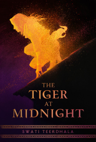
Pretty sure I legit thought these were the same book for a couple weeks. The crouching-on-the-rooftop-in-silhouette pose and the twilight background are too similar for my poor brain. XD
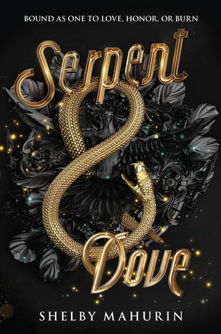


I guess every designer got the memo that black/gold snake books are legit a thing now.


I mean, do I really need to say anything about this one? Not like I would confuse the two, but come on, the similarities are so obvious.
What trends in cover design have you noticed? Any favorite or hated trends? Leave a comment below!

You picked out some really good examples, I found most of the books I tend to gravitate towards to seem to have pretty similar covers
LikeLiked by 1 person
Even the premise of the books are similar in some cases. Or the second batch, 2 of which have breathe/breath in their title. I do get kind of tired of seeing the SAME names/covers over and over, as good as they might be… I’m sure at some point we’ll end up in the next phase though!
LikeLike
I’m sure this phenom is on purpose. Cover designers/publishers identify what specific audience a book has, and try to make the cover look like the covers of other books that have recently been successful with that particular audience.
Other cover themes …
Photograph of a woman’s head and neck from behind, sometimes in sepia colors (Cleopatra, When We Were Grownups by Anne Tyler, and many, many, many others …) This style doesn’t do much for me, because I tend to think using a photograph of a person looks too prosaic. Though that’s not gonna stop me from reading an Anne Tyler.
A photograph of a sunny room or outdoor scene re-colored in bright, retro colors. (The cover of every Jennifer Wiener novel ever?)
A matte pastel cover with a bird or birds on it.
I don’t mind that covers come in trends. I figure it’s a way to help readers know what to expect, as much as that’s possible given that the really good novels are very individual.
LikeLiked by 1 person
Interesting point about cover trends giving readers a clue about what to expect! And I totally agree that publishers are trying to piggyback off of other books’ success with similar cover designs.
LikeLike